Shaping Product Strategy with Data-Driven UX
Transforming insights into action to drive the product roadmap and prioritize user needs.
My Role
UX Researcher
Timeline
8 Weeks
Team
Design
Product
Deliverables
Competitive Analysis
User Journey Mapping
Kano Survey & Analysis
User Interview Synthesis
Lo-fidelity Prototype
Overview
Right now, when someone lands on Berkadia.com or our Property Listings page, we’re pretty much in the dark about who they are or what they’re looking for. And that’s a problem—because not only is the business missing out on valuable user insights, but visitors aren’t getting a tailored experience either.
Our fix? Bring it all together! By creating a seamless connection between the Account Portal, Property Listings, and Berkadia.com, we can better understand user behavior, deliver a more personalized experience, and capture key data to help the business thrive.
Of course, pulling off a project of this scale won't happen over night. It takes thorough research to truly understand user needs and smart prioritization to shape the product roadmap. But with the right insights, we can build something that works for both the business and our users.
The Process
Sizing Up Our Competitors
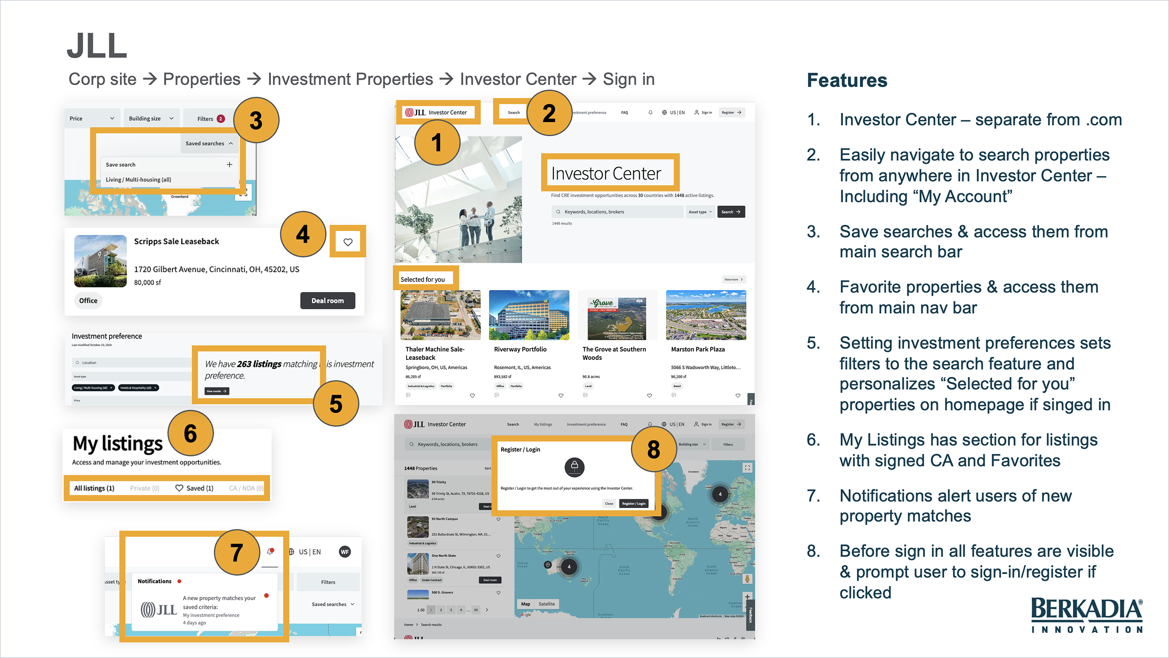
First things first—I took a deep dive into how our competitors connect their account portals, property listings, and websites to get a better feel for the experiences our users are already familiar with and see what we’re up against.
As I explored their sites, I focused on four key questions:
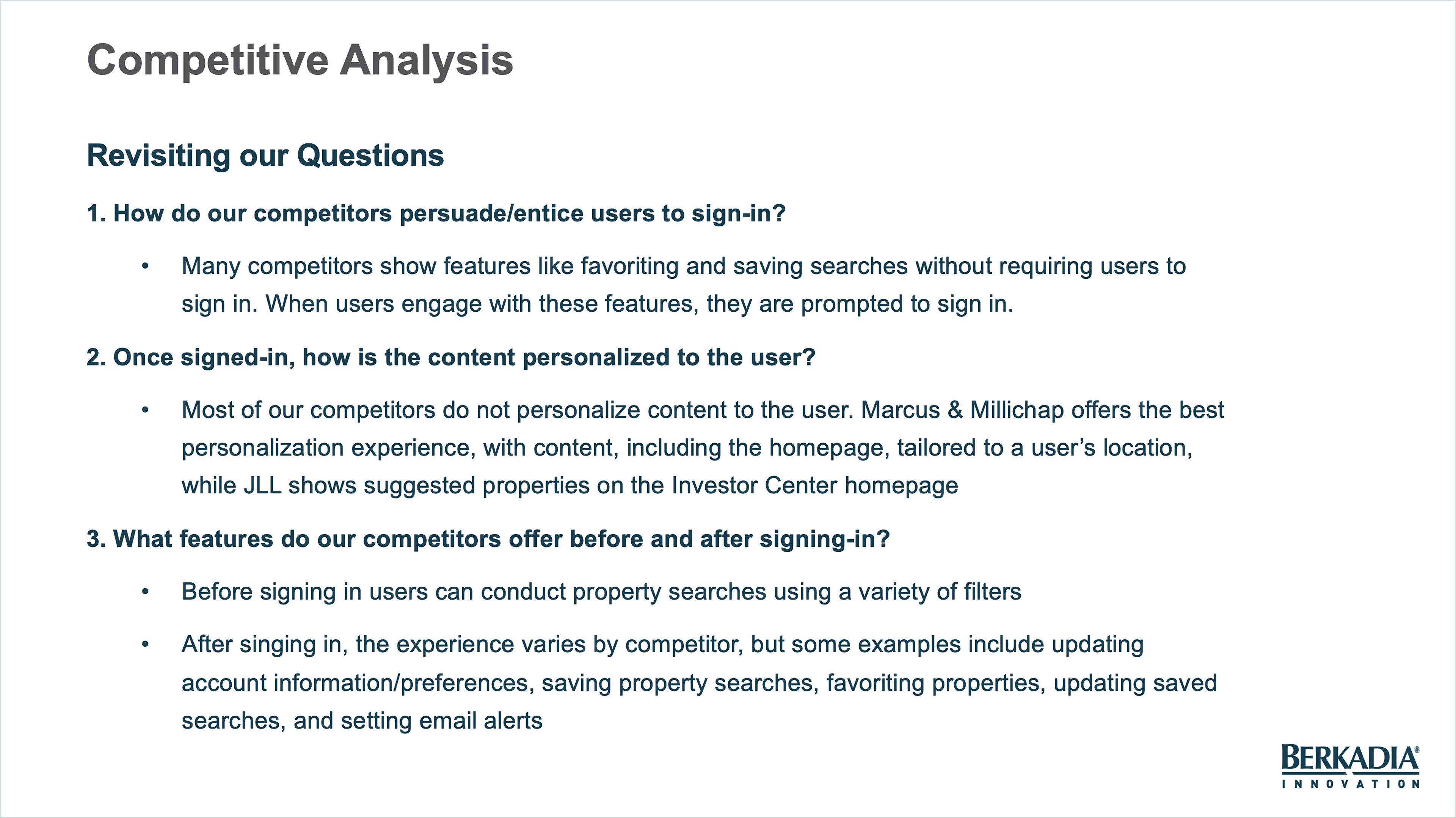
1. How do our competitors persuade/entice users to sign-in?
2. Once signed in, how is the content personalized to the user?
3. What features are offered before and after signing-in?
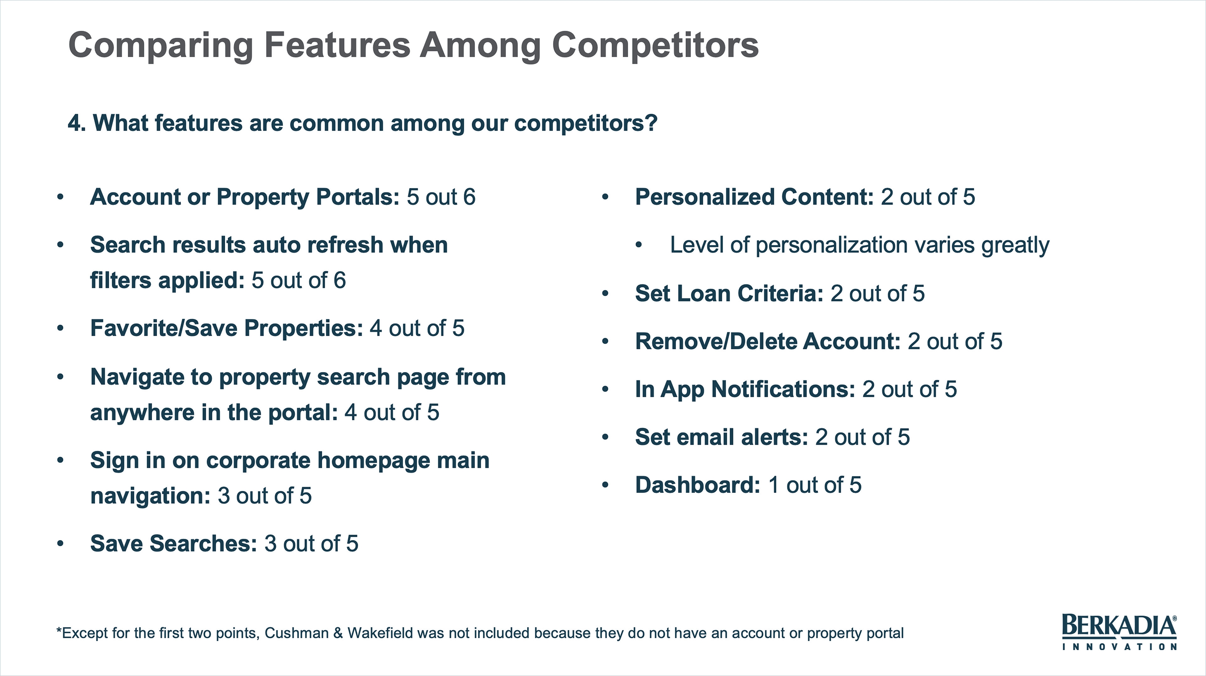
4. What features are common among our competitors?
Along with answering those big questions, I also kept an eye on the entire user experience—everything from landing on the site to creating an account. This gave me a clear view of where competitors were hitting it out of the park and, just as importantly, where we could swoop in and fill the gaps.
I made sure to note any standout features or clever patterns that worked well for our competitors—like smooth account creation, seamless property search experiences that made finding listings a breeze, or those delightful interactions that just make you feel special. But I also kept an eye out for areas where they might be losing users—like confusing navigation or lack of enticing features to encourage me to sign-in.
With this research I was able to uncover what’s working, what’s not, and where we have the opportunity to stand out. This competitive deep dive laid the groundwork for all the decisions we made later, helping us design a more intuitive, engaging, and user-friendly experience for our own users.
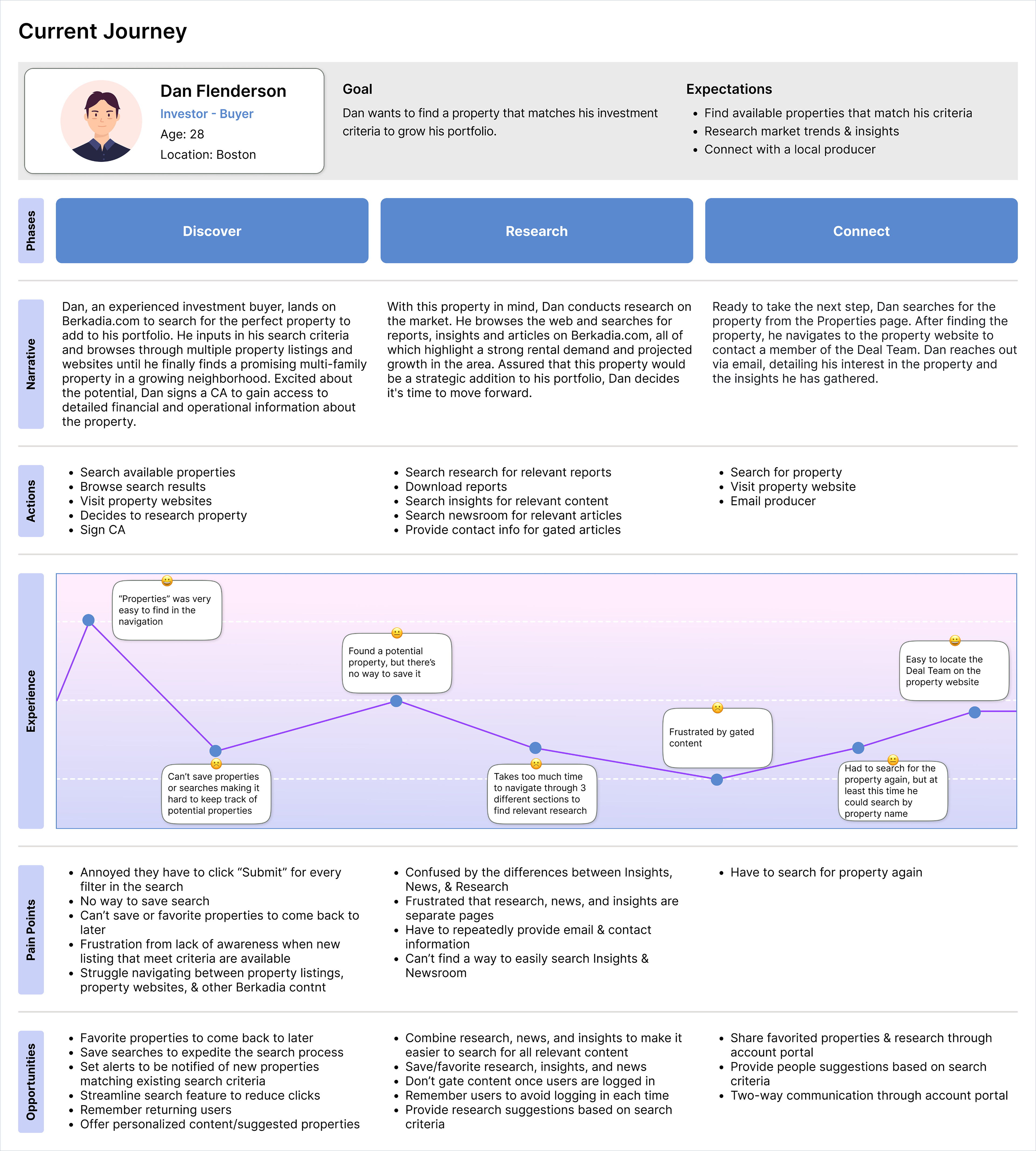
Mapping the User Journey
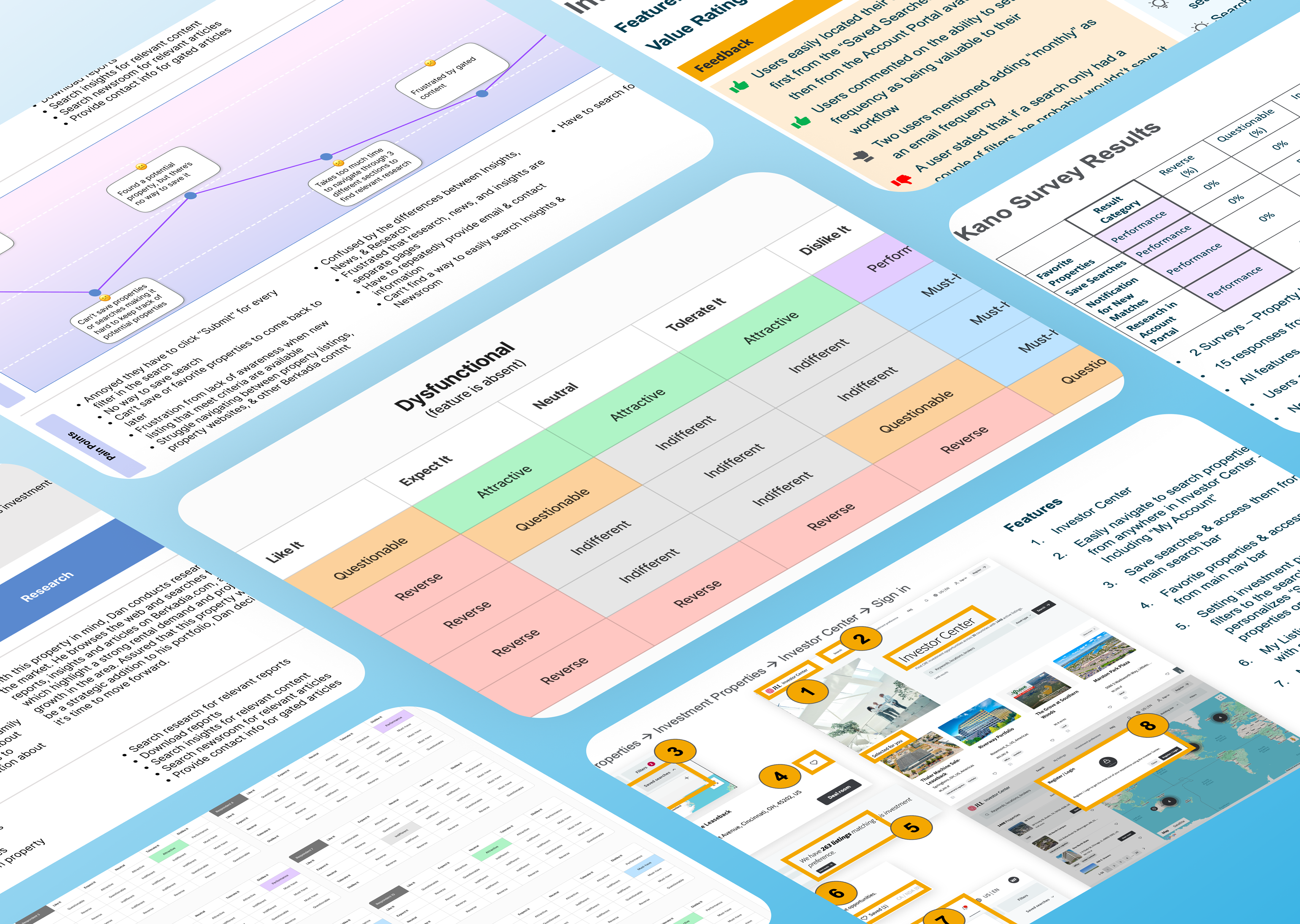
Next up, I mapped out the current user journey to pinpoint pain points and find areas that could use a little smoothing out. I started by walking through the flow step-by-step as our main persona, an investor-buyer, taking note of where things felt clunky or frustrating. Then I created a journey map to visualize the process and really highlight where users were getting stuck. To make sure I was on the right track, I dug into past research and collaborated with the product and design teams to validate assumptions and get alignment on the pain points.
Once I had the full picture, I used insights from the competitive analysis and past research to sketch out a fresh, improved journey—one that actually makes life easier for our users. A couple of the big pain points I tackled? Having to re-enter contact info to access each piece of research (so annoying, right?) and missing out on new properties that matched users' investment criteria because there wasn’t an easy way to stay in the loop.
These pain points were important to tackle because they directly impacted user engagement and ultimately the business’s ability to connect users with the right properties. Re-entering contact info isn't just a hassle—it creates unnecessary friction and makes users less likely to engage with the content. And the lack of a solid notification system for new properties means users are missing out on relevant listings, which could lead to missed opportunities for both them and the business.

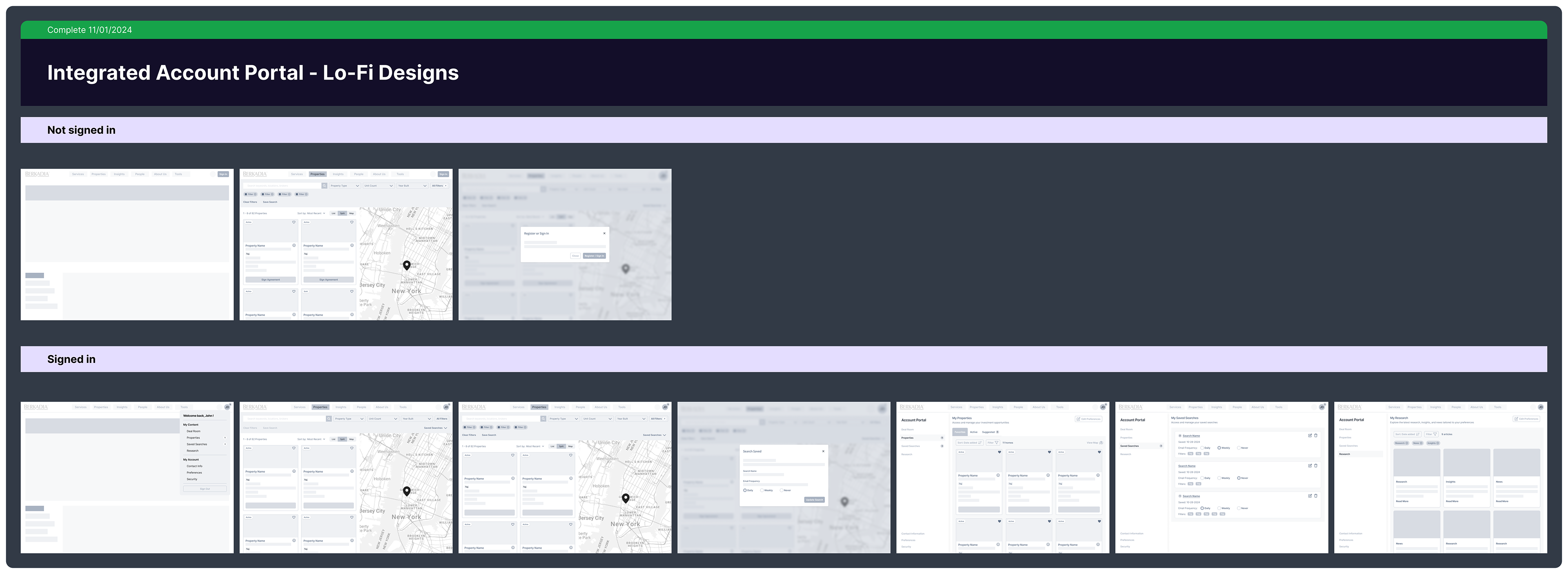
Bringing the Vision to (Lo-Fi) Life
With the improved journey as my guide, I jumped into Figma and whipped up some lo-fi designs to start bringing the vision to life. I created two flows—one for signed-in users and one for those browsing incognito—so we could see how the experience played out in both cases.
For signed-in users, the focus was all about personalization. They could save searches, favorite properties, get notifications when new listings matched their criteria, and access Berkadia news, research, and insights—all seamlessly within their account portal.
For users not signed-in, features like favoriting properties and saving searches were still available, but interacting with them would prompt a sign-in nudge. The payoff? A more personalized experience for them and richer data for the business to better understand user behavior.
These lo-fi designs became the foundation for our prototype, which we later refined based on user feedback. Once tested, we transitioned into high-fidelity designs (coming soon!), ensuring they aligned with both user needs and business goals.
Interviews & Kano Analysis
At this stage, we needed to gauge interest in the four MVP features we'd landed on:
• Favoriting properties
• Saving searches
• Notifications for new search results
• A centralized hub for Berkadia research, news, and insights
But—cue the holiday roadblock. Scheduling interviews during the proved to be a challenge. Clients were either unavailable or too busy to chat, leaving us with a smaller pool of interviewees than we planned, so we needed to pivot.
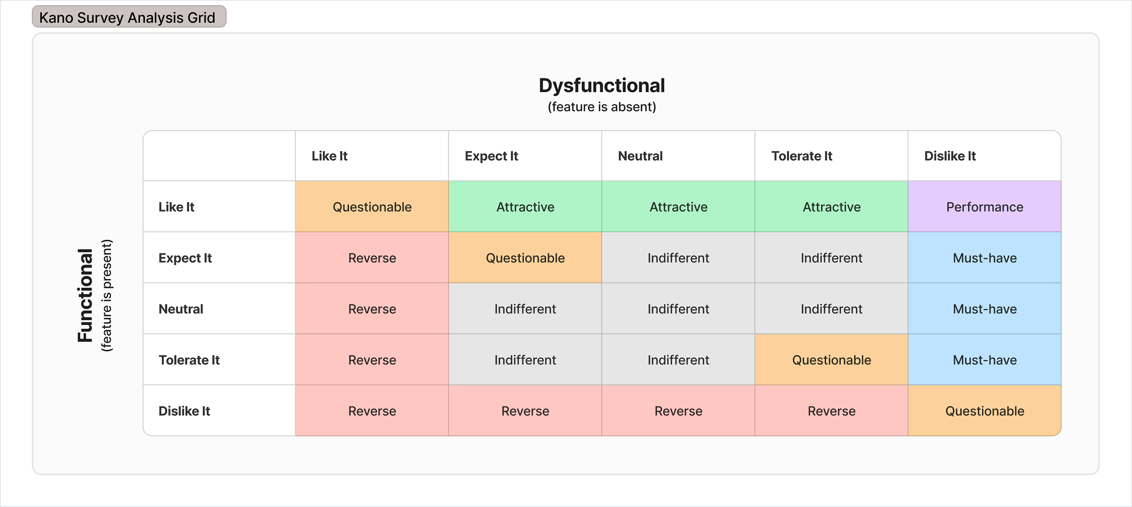
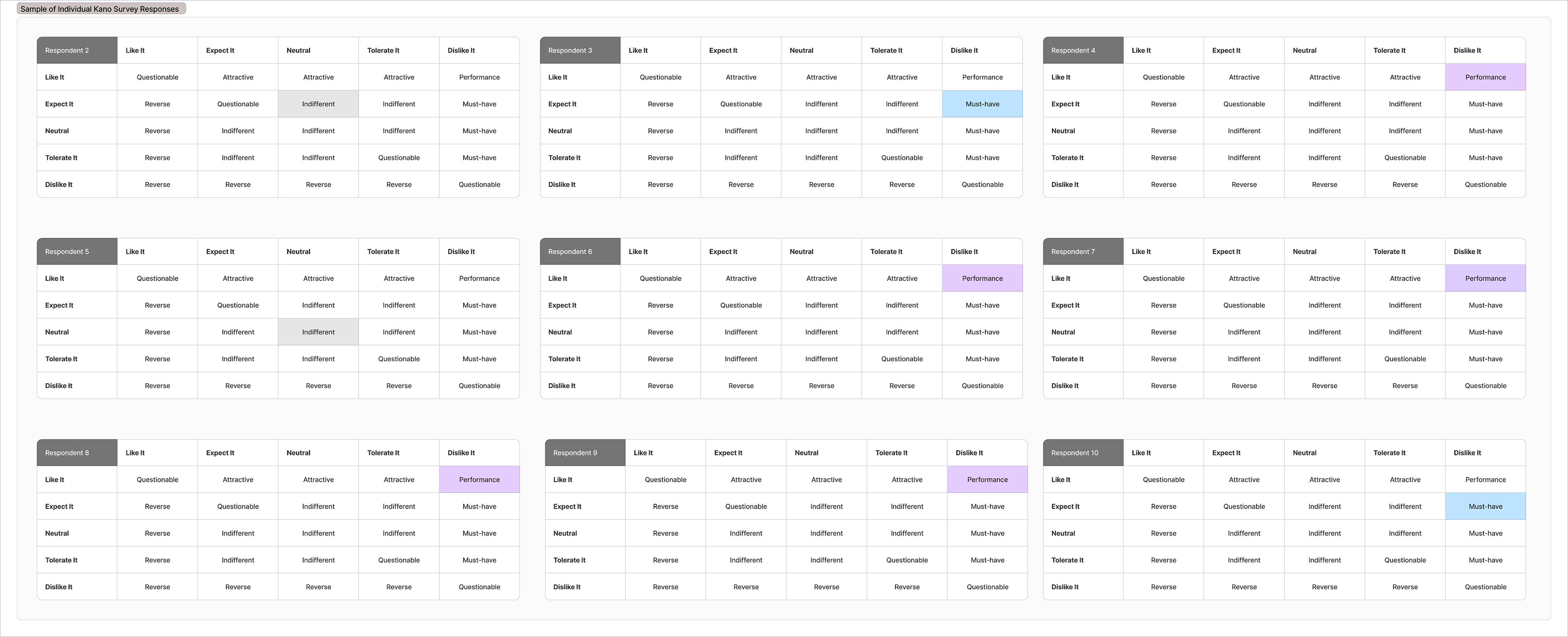
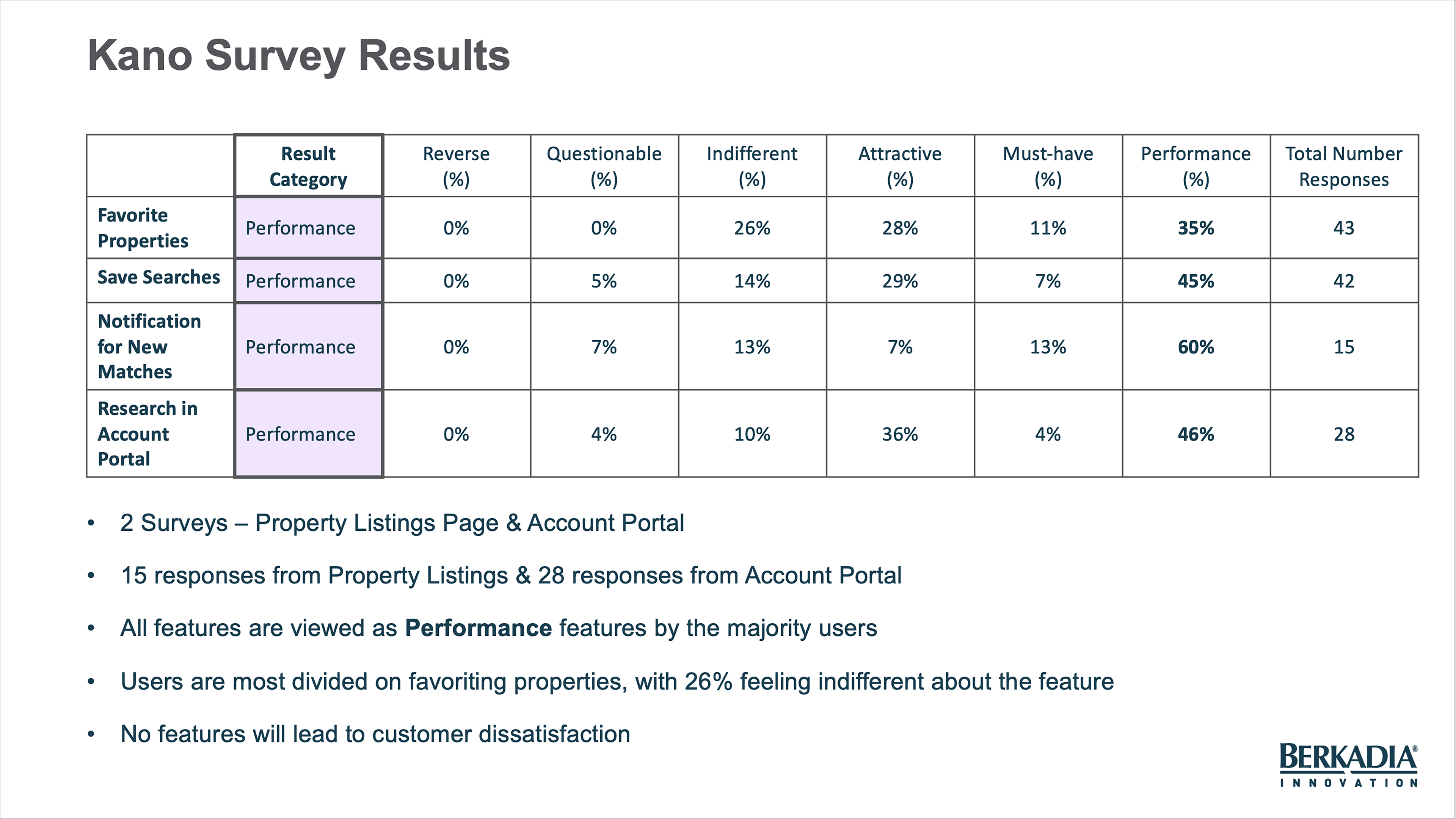
That’s when I suggested running a Kano Survey—and it turned out to be a game-changer. This survey helped us assess customer satisfaction and prioritize features based on users' feelings. It was perfect for filling in the gaps left by our limited interviews, giving us insights that directly shaped our roadmap. In fact, the Kano Survey was probably the most valuable piece of research, providing clear data that helped guide our decisions.
I set up the survey in Chisel, keeping it short and sweet to maximize responses. Over a few weeks, we gathered feedback from 43 users visiting both the property listings page and the account portal. The results mirrored what we heard in our interviews. Notifications for new search results and centralized access to research were highly valued, but favoriting properties got the most mixed responses, with some users feeling indifferent and others keen on the feature.
With the Kano Survey data in hand, we were able to refine our roadmap and focus on the three most popular features for the MVP. The survey helped us make data-backed decisions, ensuring we were prioritizing what users truly wanted while still keeping an eye on the potential for future features like favoriting properties.
What's Next?
Now that our roadmap is set, I'll dive into high-fidelity designs for the MVP! To keep everything consistent and on-brand, I'll be using the MUI component library, customized to fit our brand style guide. This will ensure a cohesive experience across the product. I’ll also stick to the design patterns already established on other pages of the website, so users feel comfortable and familiar as they navigate.
I’ll be collaborating closely with the product and dev teams to gather feedback and refine the design as needed. The goal is to create a visually appealing, user-friendly interface—focusing on accessibility, smooth interactions, and making sure it's responsive across all devices.
As we roll out the MVP, we’ll also be tracking key data points on the new features to measure both business and user value. By monitoring user engagement, feature adoption, and overall satisfaction, we’ll be able to see how well the product is meeting user needs and providing value to the business. This will help us refine the experience and prioritize any future improvements.
Key Takeaways
Embrace Flexible Research Methods—One of the key lessons learned was the power of alternative research methods like surveys, especially when time is tight. The Kano Survey helped us keep momentum going despite the holiday season delay, and its insights were pivotal in shaping a product that was aligned with user needs. It also taught us the importance of flexibility—sometimes you need to pivot your approach to keep things moving forward.